1. A man was trying to calm down a "harasser" and got pushed onto the train track. He tried to get up but wasn't able to lift himself onto the platform.
2. The photographer said that he was trying to warn the driver by flashing his light but wasn't able to get the message through.
3. I don't really think that he should have taken it when he definitely could have at least tried to lift him up.
4. I definitely don't think that this is the best thing he could have done in this situation because it makes him seem like he cared more about the photo than he did about the man about to be killed.
5. I think that they shouldn't have posted it because it makes me worry what the family thought of it. I know if it was someone I knew, I wouldn't want to see it.
6. I think anyone with a good heart would put a humans life above their own job, however, most photojournalists these days may be too invested with their job.
7. I think that it wouldn't necessarily be a bad thing if a photojournalist invested themselves in a situation because then it shows that they have compassion and human instincts to help, which is always important.
8. I think it really depends on the situation, but a photographer should usually try and stay out of a situation unless someones life is being risked, then i think anyone would want to save them.
9. I think this response (below), is the one that stood out the most to me because it just shows how invested in other peoples misery this world is. People only care about reading the story rather than feeling sorry for the family.
"How tasteless of the NY Post to publish such a grusome picture for this mans family to see. No one helped this man there were numerous videos and pictures being snapped, yet not one person tried to help save him. Disgusting."
Monday, December 15, 2014
Thursday, December 11, 2014
Final Review
Rules of Photography
Aperture- is a device that controls the amount of light admitted through an opening.
What's acceptable to photoshop in an image is a blemish or messed up teeth or something to that extreme, anything else is too far of a stretch from real and people won't take anything seriously.
Portraits
1. Rule of thirds- when you have to vertical and two horizontal lines on the photo that help you align the subject.
2. Balancing Elements- when you place your main subject off center but need something to "balance" it on the other side.
3. Leading Lines- by putting lines that direct the attention to the subject, or take you on a journey.
4. Symmetry and Patterns (repetition)- exactly what it says, when the picture presents a pattern or is equally symmetrical to the eye.
5. Viewpoint- this is when you take the picture from an interesting point of view.
6. Background- this is when you incorporate the background into the photo, or have a very simplistic background so that the eye is only drawn towards the subject of the photo.
7. Create depth- when you take a picture that shows different depths of the subject and the background.
8. Framing- this is when you are able to fit the subject into a "frame" or something that resembles that.
9. Cropping- if you crop really tight around the subject of interest it eliminates the background area from distraction.
10. Mergers and avoiding them- this is when something in the image runs into or blends in with the main subject and avoiding mergers is taking the picture from a different angle or behind a different background to avoid that.
Aperture- is a device that controls the amount of light admitted through an opening.
Shutter Speed- is the length of time the cameras shutter is open when taking the photo.
ISO- is the measurement of how sensitive a digital cameras sensor is to light. The lower the number, the slower the response to light.
What's acceptable to photoshop in an image is a blemish or messed up teeth or something to that extreme, anything else is too far of a stretch from real and people won't take anything seriously.
Portraits
Environmental- a portrait that relates to the background of the image.
Self Portrait- a portrait of yourself that you take.
Casual- a portrait of someone that is not in a background that relates to them, but in a casual background.
Exposure- the amount of light per unit area.
Depth of field- the distance between the nearest and farthest objects in a scene that appear acceptably sharp in an image. Focal Length- a lens with a focal length shorter than normal is often referred to as a wide-angle lens, while a lens significantly longer than normal may be referred to as a telephoto lens.
Magazine Covers:
1. Early Magazine Covers
Modeled after the covers of books, they often included a Title, table of contents, and sometimes a small picture.
2. The Poster Cover
Often the picture was the only thing on the cover besides the title, which even then was most often tiny and in a corner.
3. Pictures Married to Type
When words were starting to be used, but they didn't want to cover any of the picture.
4. In the Forest of Words
They figured out a way to work with the photograph, putting the words all over the cover, but never covering the face, etc.
Captions Review


Tuesday, December 9, 2014


Monday, November 24, 2014
FASHION
1. On the first video titled Evolution, they changed the size of her eyes, nose, mouth, and even shrunk her pupils. They made her neck longer and her face smaller. They brightened her hair, skin and took away her tan.
2. They made her boobs smaller her waist skinnier, her legs longer and her feet smaller. They also took away her tan.
3. In this video they changed absolutely everything about her. She was an overweight woman with short hair and they turned her into a brunette bombshell. They shrunk her leg size to about a 3, and made her butt and boobs a normal size. they gave her long hair and took away her stomach.
4. I do not think this is acceptable at all, as long as we keep photoshopping peoples bodies into what we think is acceptable, people won't ever love themselves.
5. I think it would be even more ethically wrong when he magazines claims to be authentic.
6. The only changes that are okay is to get rid of acne, but even then, don't go overboard.
7. Fashion photography is obviously what the eyes want to see, and photojournalism is what is actually happening.
8. When people are able to manipulate a photo that much, it separates the authenticity from the picture. No one will ever believe what they are seeing is the real thing.
9. I think that these videos were shown to us so that we can realize that everything we see is not always real. Don't trust fashion photography.
10. These weren't about guys because society doesn't have as high of expectations about guys as they do of girls.


Thursday, November 20, 2014
Magazines pt. 2
1. Early Magazine Covers
Modeled after the covers of books, they often included a Title, table of contents, and sometimes a small picture.
2. The Poster Cover
Often the picture was the only thing on the cover besides the title, which even then was most often tiny and in a corner.
3. Pictures Married to Type
When words were starting to be used, but they didn't want to cover any of the picture.
4. In the Forest of Words
They figured out a way to work with the photograph, putting the words all over the cover, but never covering the face, etc.
My Favorite Cover

Best Covers
1. Michael Douglas, formal
2. Germs, environmental
3. Sports illustrated, boston, environmental
4. Floyd Mayweather, formal
5. Flight Risk, formal
6. Oprah's hair cover, informal
7. Brides, formal
8. W, George Clooney, informal
9. Harpers Bazaar, informal
10. New York, Spring Fashion, Elle Fanning, informal
11. The Fader, informal
12. Vanity Fair, Kate Upton, environmental
13. ESPN, Kenneth Faried, formal environmental
14. GQ, Beyonce, informal
15. Wired, Bill Gates, formal
16. Runners World, formal
17. J. Crew, informal
Magazine Tips
1. Keep a familiar recognition from issue to issue.
2. Create curiosity.
3. Keep it intellectually stimulating.
4. Emotionally irresistible.
5. Make it worth the investment of money, and time.
2. Create curiosity.
3. Keep it intellectually stimulating.
4. Emotionally irresistible.
5. Make it worth the investment of money, and time.
Wednesday, November 12, 2014
American Soldier

b) When Ian's at home: #1-9
When he's at basic training: #10-49
When he's in Iraq: #50-70
When he's back in Denver: #71-82
The set of photos from when he was in Iraq are the most powerful to me.
c) These images work together to create a horrible/incredbile story of what thousands of men go through, even though each story is individually different.
2. a) Ian's story is told from present tense.
b) These captions enhance the pictures because you wouldn't have as good of an idea of what was going on without them.
4. a) Captions.
 |
| Ian joins a play-fight with his friends. They do this to relieve the weight of the situation. |
 |
| Ian talks on the phone with his girlfriend, they talk about marriage and their future. |
 |
| Ian's mom awaits her sons arrival. She's overcome with emotion as he walks out into the gym. |
Monday, November 3, 2014
Rules of Photography pt. 2


Viewpoint


Self Portrait and Portraits pt. 1
Tips for self portraits and portraits:
1. Frame your subject
2. Introduce Movement
3. Play with lighting
 Casual Portraits
 I like these because they show a sense of simplicity while still looking interesting, definitely not boring.
 Environmental Portraits
 I LOVE these because they have such a huge contrast. The colors are incredibly bright and intriguing as well.
 Self Portraits
 These are probably my favorite, I love simple, raw pictures of people. The emotion behind both of these pictures is unbelievable.
My plan for my portrait project is to take pictures of either Parker, or Siobhan, or Maria. They all have really striking facial features. I want to play with the lighting and create contrast on their face. I'm most likely going to take the pictures in my house. I will be using framing, and probably double exposure for these pictures.
1. Frame your subject
2. Introduce Movement
3. Play with lighting
My plan for my portrait project is to take pictures of either Parker, or Siobhan, or Maria. They all have really striking facial features. I want to play with the lighting and create contrast on their face. I'm most likely going to take the pictures in my house. I will be using framing, and probably double exposure for these pictures.
Tuesday, October 28, 2014
ISO


A good reason to use a higher ISO at a football game is because it allows you to shoot in darker places and take pictures of fast moving objects. You should stick to a lower ISO the majority of the time, like around 100 or 200. A good time to use a higher ISO is when you want to get an action shot.
Friday, October 24, 2014
Shutter


1. For a) I would use a slow shutter speed because there's not much motion.
For c) I would use a high shutter speed to capture the silver stars dancing.
2. Aperture Priority- In this one, you set the lens at aperture and it chooses the shutter speed for you.
Shutter Priority- In this one, you set the shutter speed and it chooses the aperture for you.
Manual- In this one, you must set each one yourself.
Aperture


We should relate the aperture to the pupil.
The smaller the aperture, the larger the f number, the higher the aperture, the smaller the f number.
The aperture can bring all foreground/background objects into focus.
Wednesday, October 22, 2014
Love and Loss
Looking through those photos, I was overcome with emotion. He captured every feeling that she was going through so well. You saw both ends of the spectrum and everything in between. When the husband said, "These photographs do not define us, but they are us" I think that he meant that he didn't want everyone to see them as the couple who had to go through cancer, but still wanted people to see what a big part of their life it was. I think if I was in a similar situation I might do the same thing, because I'm an extremely sentimental person. If I could write Angelo a letter, I would probably write to tell him how well he did on the "project" because aside from the awful obvious, I don't see any flaws in any of the photos.
Monday, October 20, 2014
Abandoned Theme Parks
My favorite abandoned theme park from those articles, by far, has to be the Nara Dreamland. It's also known as Japans knock-off version of Disneyland. I love all of the colors so much and I probably like it because it doesn't look too creepy.


Other places that could be interesting to take photos of:
1. Abandoned churches
2. Old wedding venues
3. Abandoned neighborhoods
4. Deserted circus set-ups
5. Half torn-down elementary schools.
I found an abandoned school called Gary Elementary School.
 I think it would be fun to document something like this because it's easy for everyone to imagine what it was like when it was filled with little kids, and then to see it all torn-down and trashed would be chilling. It's a huge contrast and would be exciting to get on camera. If I were to ever take pictures of a place like this, I would need to bring someone with me, and a really expensive camera. I would probably need permission to go on campus from the city officials.
Other places that could be interesting to take photos of:
1. Abandoned churches
2. Old wedding venues
3. Abandoned neighborhoods
4. Deserted circus set-ups
5. Half torn-down elementary schools.
I found an abandoned school called Gary Elementary School.
Africa
Reading Nick Brandt's story about photographing wild animals was extremely moving to me. The fact that he is into saving animals that are being killed every year is amazing to hear. I love how he waits a very long time to get the right picture instead of rushing it.
 This photo has to be my favorite because not only is it beautifully detailed, but you can visibly see the emotion on each of the elephants faces. This photo is a good example of simplicity. The background is cloudy but its not distracting at all. The focus is clearly on the elephants, as it should be.
He uses a Pentax 67II with two fixed lenses. He doesn't use zoom lenses because he believes being authentically close to the animals "makes a huge difference in his ability to reveal their personality." He hopes to show a sense of intimacy with these animals where that is often uncommon.
"I'm not interested in creating work that is simply documentary or filled with action and drama, which has been the norm in the photography of animals in the wild. What I am interested in is showing the animals simply in the state of Being. In the state of Being before they are no longer are. Before, in the wild at least, they cease to exist. This world is under terrible threat, all of it caused by us. To me, every creature, human or nonhuman, has an equal right to live, and this feeling, this belief that every animal and I are equal, affects me every time I frame an animal in my camera. The photos are my elegy to these beautiful creatures, to this wrenchingly beautiful world that is steadily, tragically vanishing before our eyes."
This photo has to be my favorite because not only is it beautifully detailed, but you can visibly see the emotion on each of the elephants faces. This photo is a good example of simplicity. The background is cloudy but its not distracting at all. The focus is clearly on the elephants, as it should be.
Nick Brandt
He uses a Pentax 67II with two fixed lenses. He doesn't use zoom lenses because he believes being authentically close to the animals "makes a huge difference in his ability to reveal their personality." He hopes to show a sense of intimacy with these animals where that is often uncommon.
"I'm not interested in creating work that is simply documentary or filled with action and drama, which has been the norm in the photography of animals in the wild. What I am interested in is showing the animals simply in the state of Being. In the state of Being before they are no longer are. Before, in the wild at least, they cease to exist. This world is under terrible threat, all of it caused by us. To me, every creature, human or nonhuman, has an equal right to live, and this feeling, this belief that every animal and I are equal, affects me every time I frame an animal in my camera. The photos are my elegy to these beautiful creatures, to this wrenchingly beautiful world that is steadily, tragically vanishing before our eyes."
Thursday, October 16, 2014
Captions
 |
| Little old lady, Beatrice, standing in front of her favorite store. She used to be bored when her husband went out of town.. |
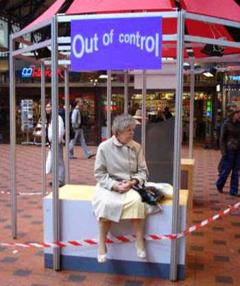 |
| Tina sitting at the bus stop. She forgot her glasses at home. |
 |
| Charlie spends yet another day in his favorite place ever. The workers are contemplating on whether they should tell him that those are monkeys, not puppies. And that this is a zoo, not a pet store. |
Great BW Photographers pt. 3
I picked Harry Callahan for my favorite BW photographer. What first caught my eye about his photos was that a lot of them were of his wife, and her silhouette. For some reason I really liked them and the way he photographed her.
For photo 1:
I see tranquility, peace and the love between Harry and his wife.
I smell nothing, maybe the smell of skin.
I hear no sound, only breathing.
I taste the air in the room.
I feel like the room was full of love and nothing else.
For photo 2:
I see vulnerability.
I smell the dust in the room.
I hear the air conditioning humming in the background.
I taste the water I drank right before.
I feel love.
If I were to do anything with Harry Callahan's photos, I would want to use a poster.
Wednesday, October 8, 2014
Photo Mural Project
I think if we could do something similar to this project, we should take advantage of the diversity at this school and take portraits of people because everyone here looks so different from each other. I kind of like the idea of sticking to phones only, preferably iPhones so that it goes along with the "Instagram" effect. I think we could put this mural on one of the walls by the library so that everyone would get a chance to see it.
Monday, October 6, 2014
Academic Shoot Reflection/Critique
I came across many challenges, one of them being that I wasn't really thinking about meeting the rules for most of the shoot. I kept thinking about getting the subject in the right position of the frame, at one point I was having to go all the way across the room for a certain shot. I think if I had to do this again, I would probably come out of my shell a little more, I had some really good ideas but wasn't confident enough to pursue them. But as far as the classrooms that I went into, I'd keep those the same. I think that rule of thirds is the easiest rule to accomplish because all you have to do is find your subject and move the camera slightly to whichever side. I think framing is the hardest rule to capture. Obviously, framing is the rule that I still don't really understand, I should probably ask a friend to explain it to me.
http://priscilladiazz.blogspot.com
I really liked this persons photos, the composition as well as the subject was really easy on the eyes, and not too distracting.
http://priscilladiazz.blogspot.com
I really liked this persons photos, the composition as well as the subject was really easy on the eyes, and not too distracting.
Academic Shoot + Reflection

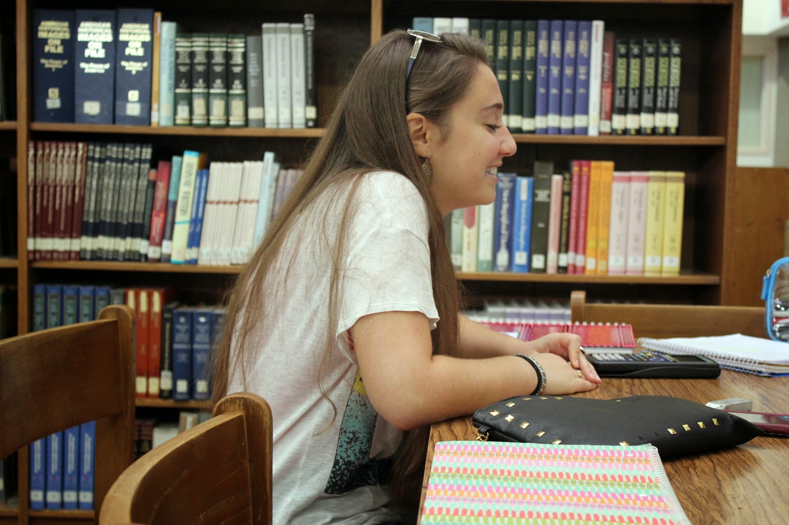
I think I followed the rule of simplicity pretty well for it being accidental. The background is easy to look at and it makes Melissa stand out. The subject of this photo is Melissa opening up a locker, I think people will be able to tell pretty easily what the subject is. If I were to redo this photo to make it more simple, I think I would have made the locker the entire background.

This one is probably the one I did pretty well, as far as rules go. The lines of the sitar railing lead directly to the boy drawing. I think it might be a little difficult for someone to be able to tell what he's doing because he's pretty far away, and the angle is from below. I don't think I would change anything about this photo.
This one barely falls under the category of framing, it might not even fit at all. Framing was a hard rule for me to figure out. This photo shows charlotte talking to somebody across the table in the library. I think this is pretty self explanatory. If I were to redo this photo I think I would make it to where the bookcase is framing her body better.

I think this photo kind of falls under the category of balance because the bench and table are the same angle. This picture is of a girl on her phone during her off period and I think that's pretty easy to figure out. If I had to redo this picture I would have centered her a little better.

This photo falls under the rule of thirds rule extremely well. Melissa is, once again, opening up her locker but this time I put her body closer to the right side. I think it's a pretty self-explanatory photo. I wouldn't change anything about it.
Subscribe to:
Comments (Atom)