I think I followed the rule of simplicity pretty well for it being accidental. The background is easy to look at and it makes Melissa stand out. The subject of this photo is Melissa opening up a locker, I think people will be able to tell pretty easily what the subject is. If I were to redo this photo to make it more simple, I think I would have made the locker the entire background.
This one is probably the one I did pretty well, as far as rules go. The lines of the sitar railing lead directly to the boy drawing. I think it might be a little difficult for someone to be able to tell what he's doing because he's pretty far away, and the angle is from below. I don't think I would change anything about this photo.
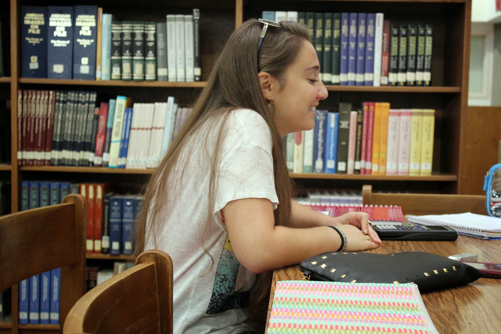
This one barely falls under the category of framing, it might not even fit at all. Framing was a hard rule for me to figure out. This photo shows charlotte talking to somebody across the table in the library. I think this is pretty self explanatory. If I were to redo this photo I think I would make it to where the bookcase is framing her body better.
Balance
I think this photo kind of falls under the category of balance because the bench and table are the same angle. This picture is of a girl on her phone during her off period and I think that's pretty easy to figure out. If I had to redo this picture I would have centered her a little better.
Rule of Thirds
This photo falls under the rule of thirds rule extremely well. Melissa is, once again, opening up her locker but this time I put her body closer to the right side. I think it's a pretty self-explanatory photo. I wouldn't change anything about it.


No comments:
Post a Comment